
Edge Cases as Design Strategy
What the Weird User Reveals About the Normal One

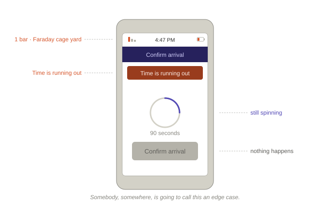
A driver pulls into the yard at 4:47pm. His delivery window closes at 5:00. He needs to tap “confirm arrival” in the app so the dock knows he’s here and his load can get pulled before the shift ends. He has one bar of signal. The yard sits behind a row of steel intermodal containers and a distribution center wrapped in foil-backed insulation, which together make a pretty good Faraday cage. The confirmation screen has been spinning for ninety seconds.
Somebody, somewhere, is going to call this an edge case.
It isn’t. It’s the job. A freight yard is loud, metal, and signal-hostile. Drivers are tired. Delivery windows are tight. Gloves are on. This is a normal Tuesday. We decided it was unusual, by quietly assuming a user who has good signal, a warm hand, a free minute, and every reason to trust that tapping something will produce a result within three seconds.
That user exists somewhere. Probably in a room with recessed lighting. He is not the driver.
The “Normal User” Is a Fiction
Nobody is the normal user. That person is a composite, stitched together from assumptions we made early and stopped examining. A charged battery, good lighting, and the attention span of someone who is not also trying to back a fifty-three-foot trailer into a dock.
Every product has a version of this list. Most of them have never written it down. Every frustrated user exposes a decision we made by default.
The gloved hand forces you to decide how big a tap target really needs to be, and to stop pretending forty-four pixels is a universal answer. The dead zone forces you to decide what the app should do when the server isn’t there. Does the confirm button work anyway and sync later? Does it tell the driver it’s queued? Does it lie? You have to pick. Spinning forever is still a decision—and usually the worst one.
The multilingual user forces you to decide whether your icons mean anything without their English labels. Do the layouts survive a German compound noun. Do the error messages still fit the button after translation.
The normal user doesn’t make us decide. The edge case does.
The Normal User Gets a Better Product
Here’s the part that surprises people. Designing for the edge case doesn’t produce a compromised experience for everyone else. It produces a better one.
Bigger tap targets for the gloved driver are also bigger tap targets for the VP tapping through a dashboard on her phone in the back of a car. Offline resilience for the dead zone in the yard is also resilience for the planner whose hotel WiFi cuts out while she’s rerouting a shipment. An app that tells you what it’s doing when the network is slow is an app that feels faster when the network is fine.
This matters beyond one driver and one yard. Enterprise software lives or dies on whether the frontline actually uses it, and the frontline decides based on what happens when things get hard. A confirm button that spins in a dead zone, a form that won’t submit on hotel WiFi, a dropdown that doesn’t survive translation—each one is a small vote against the tool. Enough of them and adoption quietly collapses. Tasks route around the software instead of through it. Support absorbs the difference. The edge case isn’t a design concern. It’s where task completion, trust, and cost actually live.
The Trap
Most teams handle edge cases last. The design gets built for the normal user, the product ships, and someone raises a hand a few weeks later about gloves, or low signal, or the German translation. A ticket gets opened. A patch gets shipped. The design grows barnacles—the main flow moves, the edge flow detours through an apologetic modal, and nobody has time to go back.
An accessibility audit at the end catches some of this. Contrast ratios, alt text, tab order. Necessary work. It won’t help the driver at 4:47pm. His problem is that the product was designed for someone else.
The edge case has to be in the room at the start. The first question in a kickoff should be who’s going to have the hardest time with this, and why. Skip it and you spend the rest of the project patching your way toward a reality you could have started from.
The Tell
The driver at 4:47pm isn’t an exception to the product. Everything the design assumed—the signal, the hand, the patience, the room with recessed lighting—is visible the moment he taps the button and waits.
That’s what the edge case is for. It’s the tell.
If the design works for him, we built a tool that does the job. If it doesn’t, we built something that photographs well.
NOTE: This piece was developed with the assistance of AI. The perspective, judgment, and conclusions are my own. The tools are new and powerful; the responsibility for thinking, judgment, and meaning remains human.