
Stop Designing Mobile Apps for Supply Chain; Start Designing for the People in It
On mobility, supply chain, and why "building an app" was never really the point

Spend a morning in an active warehouse and “mobile-first design” gets very concrete very fast. Someone in a cold bay, wearing gloves, scanning boxes at a pace that makes you tired just watching. A shift manager three rows over pulling exception reports on a tablet. A driver at the gate waiting to confirm his slot. Same operation, but almost nothing in common in what they need from technology.
That gap is where most enterprise mobile strategies break down. The industry has spent years asking ”How do we build a mobile app?” when the actual questions—”What does each person need?” and “What’s the best way to reach them?”—were never really on the table.
The Environment Is the Design Brief
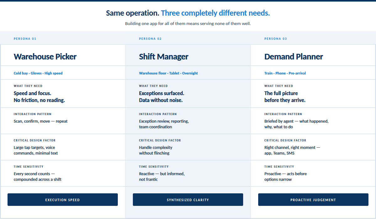
A warehouse picker’s job is repetition at speed: scan, confirm, move, repeat. They complete five or ten steps, hundreds of times a shift. An interaction that takes two seconds instead of one isn’t a minor inconvenience. Compounded across a shift, it’s a real productivity hit. Pickers need bigger tap targets, more visual and less text, voice commands when they can get them.
The manager overseeing that same operation is in a completely different cognitive space. Data synthesis, exception management, and reporting. Sub-second reaction time is irrelevant. Building one app for both would make both of them worse at their jobs.
The environment isn’t a constraint to design around. It’s the starting point where the design really begins.
What’s easy to miss is that the experience doesn’t stop at the screen. In environments like warehouses, yards, and loading docks, the physical conditions are part of the interface. Lighting, noise, gloves, movement, time pressure—these factors shape what good software looks like just as much as the device it runs on. Designing for mobile in supply chain means designing for the reality of the work itself.
So we build separate apps. Not because it’s easier (it isn’t), but because an app that tries to serve every user ends up serving none of them. A picker app should be so fast and focused it barely feels like software. A manager app should handle complexity without flinching. Those are different products—and different experiences. Those are different products, different experiences, different definitions of what “good” even means. Treating them as one is where the industry keeps getting this wrong.
Most of the Supply Chain Never Got a Mobile Strategy
The mobility gap runs further than the warehouse floor. Mobile technology in supply chain has historically gone to people already in the field. Everyone else works at a desk, so the industry decided they didn’t need mobile. Planners had to wait until they got to the office to find out what happened overnight. That was the deal for twenty years.
It’s a bad deal. Not just because the timing is off, but because of what late information does to a decision. A planner who finds out about a disruption at 9 a.m. is already behind—reacting to something that’s been in motion for hours, working with options that have already narrowed. The same planner, briefed on the train, arrives with the full picture and asks different questions. The decisions are genuinely better, not just faster.
That’s probably the most underexploited design opportunity in enterprise software right now.
“Mobility” Is Bigger Than Apps
When we talk about reaching users where they are, we mean it more literally than the phrase usually implies. It means asking where someone is right now—and what the most natural way is to reach them there.
For a planner, that might be a mobile app or a message in Teams from an agent that’s been watching their data. For a truck driver, it might be a simple SMS confirming the yard they’re heading to has an open slot.
The goal isn’t to have a strategy for mobile apps. It’s to have a strategy for reaching your workforce—on the right channel, at the moment they need to act. Sometimes that’s where they already are. Sometimes it’s somewhere they’ve never been.
The Interface Is Changing Underneath All of This
Dashboards, list views, detail screens, tables with forty columns are starting to show their limits. They were always an approximation—slices of data users had to synthesize on their own. No one ever told them the why.
Think about what that planner actually needed on the train. Not forty rows of exceptions waiting at their desk. Just a summary: what happened, why it matters, what to do about it. When the interface is a conversation, it travels—phone, Teams, SMS. The channel almost stops mattering, which is exactly the point
This isn’t a futurist argument. The industry spent years perfecting the app and never asked who was using it. Start with the work. The app was never the point.
NOTE: This piece was developed with the assistance of AI. The perspective, judgment, and conclusions are my own. The tools are new and powerful; the responsibility for thinking, judgment, and meaning remains human.
 | A guest post by
|